
Colour can make or break a space.
The right shade can brighten a gloomy hallway, make a small bedroom feel bigger, or turn a dull lounge into a vibrant hangout spot.
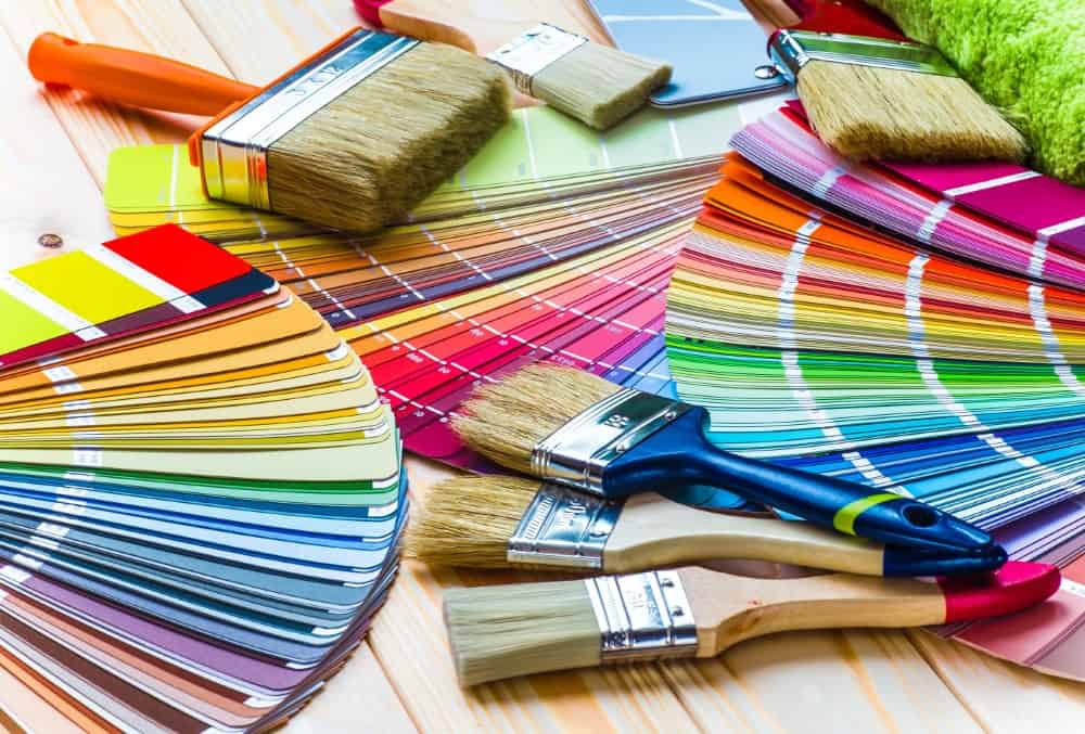
But how do you choose the best colours when faced with thousands of paint swatches and Pinterest ideas?
Should you follow trends or trust your gut?
And what if you get it wrong?
Let’s break down the art and science of picking the perfect palette for your home.
Why Colour Matters More Than You Think
Colour influences mood, perception, and even behaviour.
It can make a room feel warm and cosy or cool and calming.
Studies have shown that:
Blue lowers heart rate and reduces stress.
Red increases alertness and can stimulate appetite.
Green boosts creativity and is easy on the eyes.
When decorating, you’re not just choosing paint.
You’re shaping how a space feels, functions and flows.
So ask yourself:
What do I want this room to do for me?
Start With the Room’s Purpose
Before you look at a single paint chart, define what the room is for.
Colour should serve function.
Is it a place to relax? Work? Entertain guests?
Here are some smart matches between room function and colour:
Living Room: Warm neutrals like taupe, sand or olive invite conversation and comfort.
Bedroom: Soft blues, lavenders and greys promote rest and tranquillity.
Kitchen: Sage green or pale yellow gives freshness and energy without being overstimulating.
Home Office: Off-whites with hints of green or blue enhance focus.
Dining Room: Rich shades like navy or terracotta add depth and formality.
Don’t pick colour in isolation. Let the room’s use guide you.
Consider the Natural Light
Lighting changes everything.
What looks like beige in a paint shop might turn greenish-grey under your bedroom light.
Ask yourself:
How much natural light does this room get and when?
Some practical tips:
North-facing rooms get cooler light. Choose warm tones to balance it.
South-facing rooms enjoy bright, warm light. Cool colours can stop it from feeling too hot or washed out.
East-facing rooms catch morning light. Soft, warm tones keep them cosy throughout the day.
West-facing rooms glow in the evening. Rich hues like rust or ochre can play off golden-hour light.
Test paint on the wall and observe it throughout the day.
Light changes. So should your decision-making.
Use the 60-30-10 Rule
Design needs structure.
The 60-30-10 rule is a timeless ratio to guide your palette:
60%: Dominant colour — walls, large furniture.
30%: Secondary colour — rugs, curtains, side chairs.
10%: Accent colour — cushions, art, accessories.
Let’s say you love navy.
You could use:
60% warm grey walls and sofa
30% navy curtains and rug
10% mustard or burnt orange cushions
The result is balanced, not boring.
Structure gives freedom.
Don’t Forget Undertones
Two greys are never the same.
One leans blue. Another leans pink.
Every colour has an undertone a hidden hue that changes how it looks.
Here’s how to spot it:
Place the colour next to a true white. The undertone will show.
Compare it to other similar shades. The contrast reveals subtleties.
Some examples:
A grey with green undertones feels calm and natural.
A grey with purple undertones can feel cold or sterile.
Look for undertones in:
Wall paint
Flooring
Countertops
Fabrics
All of these can clash if undertones don’t align.
Build From What You Already Own
You don’t have to start from scratch.
Your sofa, flooring, or that antique cabinet you love, these can all guide your colour choices.
Ask:
What’s staying in the room, and what’s going?
Use a piece you love as a starting point.
For example:
A green velvet sofa pairs well with off-white walls, brass fixtures and dark wood.
A red Persian rug can anchor a scheme of cream walls, walnut furniture and navy accents.
Pull colours from items you already own.
Let them lead the design.
Use Colour to Create Flow
Your home is a whole, not a set of separate boxes.
Using related colours in different rooms creates visual flow.
This doesn’t mean painting every wall the same shade.
Here’s how to do it:
Choose a base neutral for all common areas. Vary the accent colours by room.
Stick to one colour family. A soft blue in one room can transition to teal in another.
Repeat certain shades in accessories across rooms to create connection.
Think of it like music, variation on a theme keeps the whole house in harmony.
Beware of Colour Trends
Trends are tempting.
But just because sage green is all over Instagram doesn’t mean it’s right for your space.
Trends pass. Good design lasts.
Instead of chasing what’s hot, ask:
Does this colour work for me?
Will I still love it in five years?
That said, trends can be useful as accents.
A trendy colour on cushions is a low-risk way to experiment.
Paint is changeable, but furniture and flooring are harder to update.
Be cautious, not fearful.
Let trends inspire, not dictate your choices.
Sample Before You Commit
Never buy a tin of paint without testing it first.
Samples are your best insurance.
Here’s how to test smartly:
Paint large swatches on different walls.
Check the colour in natural and artificial light.
Live with it for a few days.
Don’t rely on photos. Colours look different on screens.
What seems blush pink online might be bubblegum in person.
Spending £5 on a tester pot can save you £100s in repainting.
Think Beyond Paint
Colour isn’t just on the walls.
Other elements that impact your palette:
Flooring: Wood has undertones too, oak is yellowish, walnut is red-based.
Furniture: Consider fabric colour and finish.
Textiles: Rugs, cushions, throws and curtains all add colour and texture.
Artwork: A bold piece can set the tone for a whole room.
Fixtures: Brass, chrome or black finishes add contrast or cohesion.
A neutral wall can come alive with rich materials.
Sometimes restraint lets the rest of the room sing.
Take Inspiration From Nature
Nature is the best designer.
Its colours are always in balance.
Try these nature-inspired combos:
Forest: Moss green, bark brown, soft beige
Ocean: Navy, sand, seafoam green
Autumn: Rust, ochre, charcoal grey
Sunrise: Coral, lavender, pale gold
These palettes feel grounded because they exist in the real world.
Nature never gets colour wrong.
Ask: How Do You Want to Feel?
Colour isn’t just about style, it’s about emotion.
Do you want the space to feel calm? Energising? Sophisticated?
Match mood to hue:
Calm: Cool tones like sage, sky blue, dove grey
Energetic: Warm tones like terracotta, sunflower yellow, coral
Elegant: Deep tones like navy, emerald, burgundy
Playful: Brights like teal, chartreuse, bubblegum pink
Every room tells a story.
Make sure yours is saying what you want it to say.
Final Thoughts
Decorating is about decisions.
And colour is one of the most important ones.
You don’t need to be a designer to get it right.
You just need to:
Think about how the room is used
Understand how light affects colour
Use tools like the 60-30-10 rule
Test, compare, adjust
Follow your instincts. not just fashion
When in doubt, trust what feels good.
After all, you’re the one living there.
Let your colours reflect that.